Brand Materials
Branding connects design with identity. I create visual systems and brand materials that keep communication consistent and engaging.
These bill leaflets were designed for Richmond Station, a well-known Toronto restaurant where I worked as a student. One promotes lunch service and event hosting with bold typography and vibrant red tones, while the other highlights the Richmond Station Garden with a nostalgic design that emphasizes fresh, seasonal produce and community.


This business card was created as part of a school branding project exploring the word ‘Spot.’ The design centers around the idea of a location marker, representing precision, discovery, and a clear point of focus. Clean typography paired with a warm orange palette creates a modern, approachable feel, while the circular mark reinforces the concept of a specific destination. The minimalist layout balances clarity and visual impact, reflecting a professional identity that’s both memorable and versatile.
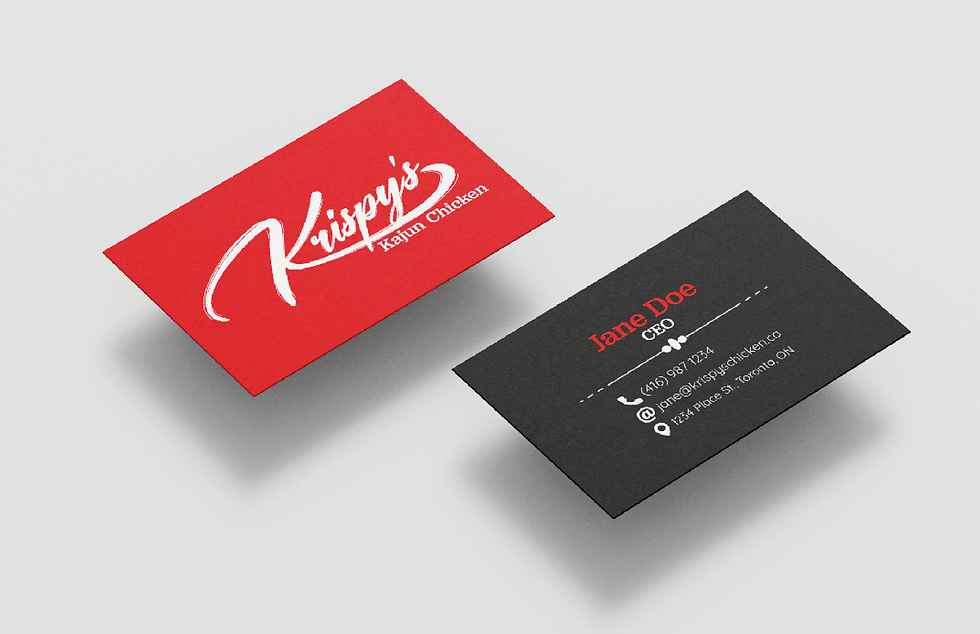
This branding proposal for Krispy’s Cajun Chicken was designed to capture the bold, flavorful character of the restaurant’s Southern-inspired menu. The visual identity uses a striking red and black palette paired with dynamic, hand-drawn typography to evoke energy, warmth, and a sense of authenticity. The cohesive system spans business cards, packaging, and a website interface, ensuring a strong and memorable brand presence across both print and digital platforms. The design aims to reflect not just the food itself, but the lively and welcoming personality of the brand.


This branding proposal for Veld Music Festival in Toronto captures the event’s high energy through a bold black and orange palette and dynamic typography. The cohesive system extends across business cards and merchandise like phone cases, creating a strong visual identity that reflects the festival’s excitement and community.